Best Fonts for Small Embroidery Names (Plus Block, Script and Monogram Fonts)
Small names are where fonts fail first. Here are the font styles that stay readable at small sizes, the minimum letter heights to use, and what to pick for caps and towels.
Embroidery Digitizing Studio
Commercial Digitizing Service
Need production-ready machine files? Explore our Custom Embroidery Digitizing
The best fonts for small embroidery names are simple block or sans-serif fonts with even, fairly thick strokes and open letter shapes, stitched at least about 5 mm tall in capitals. Bold scripts also work for names, but only from about 12 mm tall, because their joins and loops close up below that. Thin serifs, hairline scripts and condensed fonts are the ones that usually fail.
Thread is thicker than a printed line and the fabric moves as it is stitched. A font that looks elegant on screen can close up, lose its serifs or turn wavy in thread. This guide explains what makes a font embroider well and how to choose one for names, logos, caps and towels. If you already have lettering artwork, our embroidery digitizing team can turn it into a clean machine file.
What Makes a Font Good for Embroidery
- Even stroke width: strokes of similar thickness stitch evenly. Fonts with very thick and very thin parts lose the thin parts.
- Strokes wide enough for satin: roughly 1 to 1.5 mm wide or more lets the digitizer use satin columns, which give embroidery its shine.
- Open counters: the holes in letters like a, e, o and R must stay open after the thread spreads.
- Simple serifs or none: tiny serifs turn into bumps. Slab serifs are fine; delicate serifs are not.
- Comfortable spacing: tightly kerned letters touch once stitched. Embroidery lettering usually needs a little extra spacing.
Best Embroidery Fonts by Style
| Style | Example fonts | Why they stitch well | Use for |
|---|---|---|---|
| Block and sans-serif | Arial Bold, Helvetica Bold, Montserrat SemiBold, Impact | Even, thick strokes and open letter shapes | Company names, uniforms, caps, any small text |
| Slab and collegiate serif | Rockwell, Clarendon, varsity block styles | Thick, square serifs that hold as satin stitches | Team wear, jackets, caps, athletic lettering |
| Bold script and cursive | Brush Script, Pacifico, Lobster | Thick strokes with clean joins and modest loops | Names, boutique branding, gifts, at larger sizes |
| Monogram | Bold decorative and interlocking monogram styles | Stitched large, so detail survives | Towels, robes, bags, linens |
| Risky: hairline and condensed | Thin scripts, light weights, fine book serifs, condensed fonts | Strokes are too thin for satin and counters close up | Only at large sizes, or redrawn bolder |
The font names are examples of stroke weight and shape, not a fixed list. Any font with similar proportions will behave the same way; what matters is the thickness of the thinnest stroke at the size you sew.
Block and Sans-Serif Fonts
Block and medium-weight sans-serif fonts are the workhorses of embroidery. They read clearly on polos, workwear and caps and survive small sizes better than any other style. They are the best choice for company names, uniform text and anything under about half an inch tall. For placement and sizing on shirts, see our left chest logo size guide.
Serif and Slab Fonts
Collegiate and slab-serif fonts look strong on caps, jackets and varsity designs because their serifs are thick. Classic book serifs with fine hairlines need a larger size, otherwise the serifs vanish. For bold athletic lettering, applique or tackle twill often looks better than solid stitching. See our applique digitizing service.
Script and Cursive Fonts
Script fonts are popular for names, boutiques and gifts. The best cursive fonts for embroidery have fairly thick, even strokes and clean connections between letters. Avoid fonts with long hairline swashes. Give scripts more height than block text, because their lowercase letters are small compared with the capitals. To stitch a real signature or handwritten note instead of a font, see how to digitize handwriting for embroidery.
Monogram Fonts
Monograms are usually stitched larger, so decorative fonts work well here. On towels and fleece, the pile can swallow thin strokes. Use bold letters and a knockdown or topping layer. Our towel and fleece embroidery guide explains how.
Minimum Letter Sizes for Embroidery
| Lettering | Minimum capital height | Notes |
|---|---|---|
| Block or sans-serif capitals | About 5 mm (0.20 in) | The safe minimum for satin lettering |
| Lowercase and serif fonts | About 6 to 7 mm (0.25 in) | Keeps lowercase letters and serifs open |
| Script names | About 12 mm (0.5 in) | Keeps joins and loops readable |
| Small text in 60 wt thread | About 4 mm (0.16 in) | Needs a 65/9 or 70/10 needle and a file built for fine thread |
| Text on beanies, fleece and towels | About 6 mm (0.25 in) and bold | Pile and ribs swallow thin strokes; add a knockdown layer or topping |
| Text on caps | Short and bold, inside about 2 to 2.25 in of height | The curved front panel limits height. See our cap and hat logo digitizing service. |
| 3D puff lettering | Every stroke at least about 3 mm wide | Thinner strokes cannot hold foam; see flat embroidery vs 3D puff |
Best Fonts for Small Embroidery Names
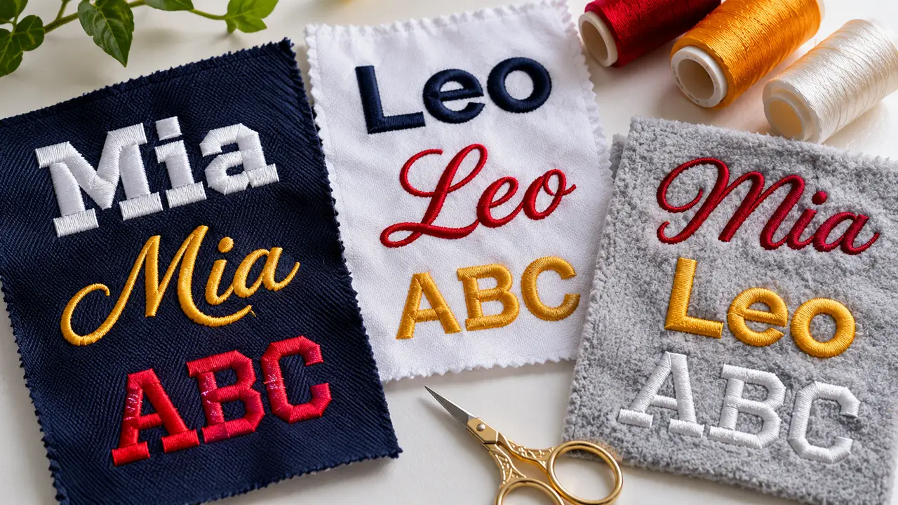
Names appear on towels, baby blankets, team jackets and workwear. The fabric decides the font:
- Towels, fleece and minky: bold script or rounded sans-serif with thick strokes, plus a knockdown base.
- Workwear and scrubs: simple block or sans-serif at 5 to 8 mm tall for fast, readable name tags.
- Team jackets and hoodies: collegiate block or bold script, often 1 to 3 inches tall.
- Caps: short names in bold block letters. Raised lettering can be done with 3D puff digitizing when letters are wide enough.
| Name height | Font style that stays readable | Avoid |
|---|---|---|
| 4 to 5 mm (60 wt thread) | Plain block capitals or a simple sans-serif | Script, serifs and lowercase-only names |
| 5 to 8 mm | Block, sans-serif or rounded sans; capitals read best | Thin serifs, condensed fonts and hairline scripts |
| 8 to 12 mm | Sans-serif upper and lowercase, slab serifs, a heavy script for short names | Scripts with long swashes or tight joins |
| 12 mm and up | Bold script, collegiate block and monogram styles | Very thin decorative fonts at any size |
For a set of uniforms with different names, size the layout for the longest name first, then keep the same letter height on every garment so the set looks consistent. Our small lettering digitizing guide covers the density and underlay that keep small names open.
Why Typed Fonts Still Need Digitizing
Many machines and programs include built-in keyboard fonts, and they are fine for simple names. Custom lettering from a computer font is different: the outline has to be turned into satin columns or fills with underlay, stitch angles and pull compensation. Auto-converting a font usually gives weak joins and inconsistent widths. Read common embroidery digitizing mistakes to see what goes wrong.
When you order lettering, send the font name or artwork, the finished width, the garment and your machine format. Check the pricing page for typical costs, or contact us with your text and we will suggest a size that stitches clean.
Lettering also depends on the thread and needle you use. Pair this guide with our embroidery thread weight guide and machine embroidery needle size guide.
Written by the Velora Digitizing Team
Digitizing StudioThis guide is written and reviewed by the digitizers at Velora Digitizing, who prepare embroidery files for caps, jackets, patches, and left chest logos every day. The advice here comes from the same stitch-path, underlay, and fabric choices we make on client orders.
Related service
Custom Embroidery Digitizing