How to Prepare Your Logo for Embroidery Digitizing
The better your artwork, the better your embroidery. A few small changes to your logo before digitizing can be the difference between a clean sew-out and a blurry mess. Here is a checklist you can run through in ten minutes.
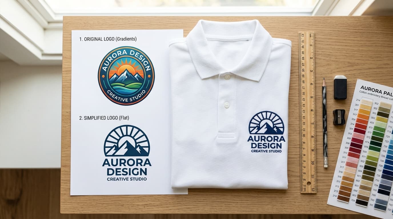
Most digitizing problems start before the digitizer opens the file. A logo designed for a website has thin lines, tiny text, drop shadows and gradients that simply do not translate to thread. A good digitizer will fix a lot of this, but every fix is a guess about what you would prefer. Spending ten minutes preparing the artwork removes the guesswork and gets you a better file, faster.
1. Send the Best File You Have
In order of preference, send a vector file (AI, EPS, SVG or PDF), then a high-resolution PNG with a transparent background, then any JPG. Vectors let the digitizer snap stitches to exact edges. A 300 dpi PNG at least 1500 pixels wide is nearly as good. A 200 pixel JPG pulled from a website forces the digitizer to redraw everything by eye.
If all you have is a small or blurry image, get it vectorized first. Our vector art conversion service redraws logos manually into clean paths that are then used for digitizing, printing and everything else.
2. Decide the Finished Size First
Everything else depends on this. A logo that looks fine at 12 inches on a jacket back will lose all its detail at 3 inches on a cap. Typical placements:
- Left chest: 3 to 4 inches wide
- Cap front: 2 to 2.5 inches tall, up to 4.5 inches wide on structured caps
- Sleeve: 2 to 3 inches
- Jacket back: 10 to 12 inches wide
- Patches: usually 2.5 to 4 inches
Once you know the size, look at the logo at that size, not zoomed in. If any element becomes smaller than a grain of rice, it needs to be enlarged, simplified or removed.
3. Check Text Size and Font
Embroidered text has hard limits. Block capitals need to be at least 5 mm tall; lowercase and script fonts need 6 to 7 mm. If the tagline under your logo is 3 mm tall at the finished size, no digitizer can make it readable. Options are to enlarge the text, drop it, or move it to a separate placement.
Fonts with very thin strokes (light weights, thin serifs, hairline scripts) also struggle. Thread has a minimum width of about 1 mm for a satin column. Choose a medium or bold weight, or ask the digitizer to thicken the strokes.
4. Thicken Thin Lines
Any line thinner than 1 mm at finished size becomes a single running stitch, which looks like a faint dotted line rather than a solid stroke. Outlines around letters, thin borders and fine details should be at least 1 mm, ideally 1.5 mm, so they can be sewn as satin.
5. Remove Gradients, Shadows and Glow Effects
Thread is one color. Gradients, soft shadows, transparency, inner glows and bevels cannot be embroidered as they appear on screen. Replace them with flat colors. If shading is essential to the design, a digitizer can blend two thread colors with layered fills, but this only works on areas larger than about 2 cm and adds stitch count and cost.
6. Limit the Number of Colors
Each color is a thread change and a trim, and most commercial machines hold 12 to 15 needles. Most logos look best with 3 to 6 thread colors. If your logo has 14 shades of blue, pick two. Fewer colors also mean a faster, cheaper sew-out and fewer places for registration to drift.
For color matching, send Pantone codes or the thread brand and number if you have them. Digitizers match to Madeira, Isacord or Robison-Anton thread charts; a Pantone reference makes that match accurate rather than approximate.
7. Simplify Tiny Details
Look at your logo at the finished size and ask what actually needs to be there. Small stars, textures, dotted patterns, tiny icons and registered trademark symbols often disappear or turn into a blob of thread. Removing them makes the main elements cleaner and the file cheaper. You can always keep the full-detail version for print.
8. Tell the Digitizer About the Fabric
The same logo is digitized differently for a pique polo, a fleece hoodie, a structured cap, a canvas bag and a twill patch. Thick, fluffy fabrics need heavier underlay and slightly wider satin; stretchy fabrics need more pull compensation; caps need centre-out sequencing. Always say what it is going on.
Pre-Digitizing Checklist
- 1Best available file: vector preferred, or PNG at 300 dpi.
- 2Finished size and placement confirmed.
- 3Smallest text at least 5 mm tall.
- 4Thinnest line at least 1 mm wide.
- 5No gradients, shadows or transparency.
- 63 to 6 colors, with Pantone or thread codes if you need exact matches.
- 7Fabric and product type noted.
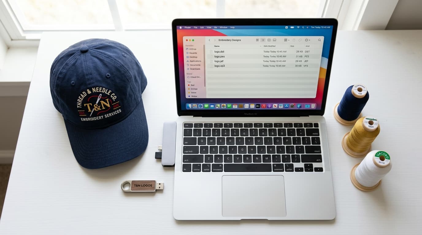
- 8Machine format known (DST, PES, JEF and so on).
Run through this list and your digitizer can go straight to work. If you are not sure whether your artwork is ready, send it anyway through our contact page. We will tell you exactly what needs adjusting, and where a fix is small we will simply make it as part of the digitizing job at no extra charge.
Related service
Vector Art Conversion