10 Common Embroidery Digitizing Mistakes and How to Avoid Them
When embroidery goes wrong, the machine usually gets the blame. In most cases the file is the problem. These are the ten digitizing mistakes we see most often in files sent to us for repair, and what a correct file does instead.
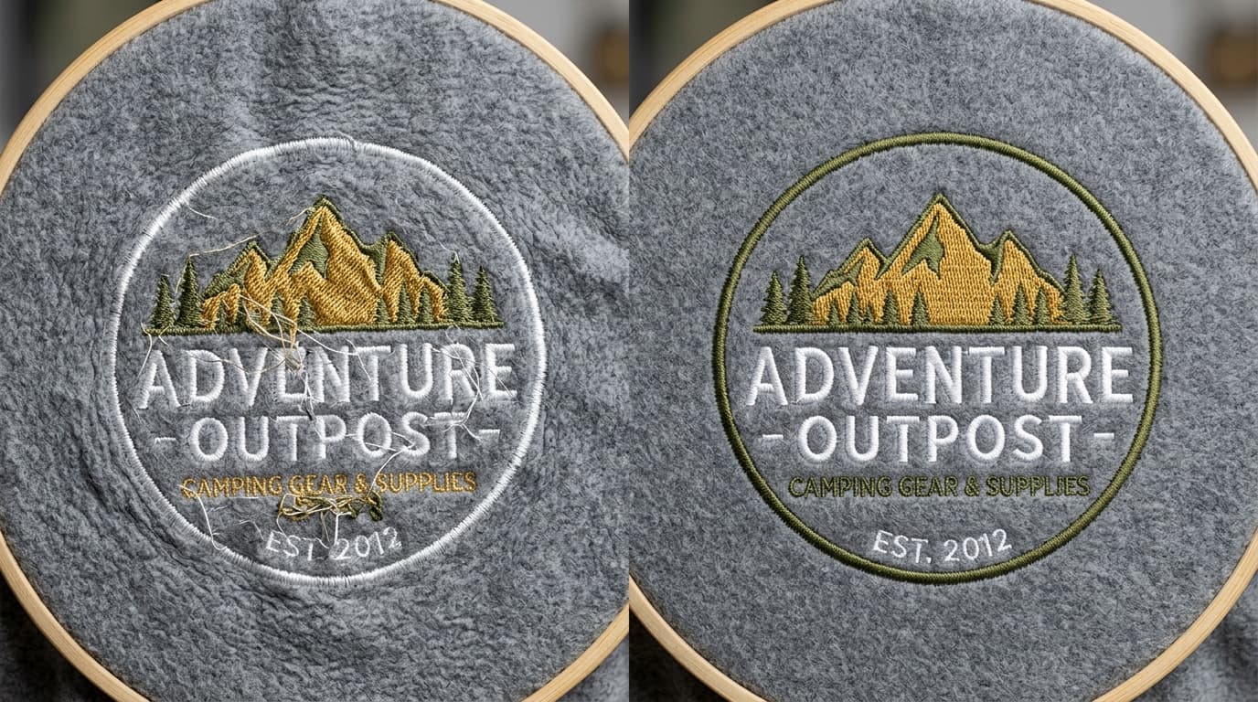
We repair a lot of files that customers received from other sources. The same handful of mistakes appear again and again, and almost all of them come from auto-digitizing or from a digitizer who never test-sewed the design. Here are the ten most common ones, what they look like on fabric, and how a properly digitized file avoids them.
1. Wrong or Missing Underlay
What it looks like: the logo sinks into fleece or towelling, satin edges look ragged, fills look thin and the fabric shows through. Underlay is the hidden layer of stitches sewn first to stabilise the fabric and lift the top stitches. Auto-digitizers either skip it or apply the same underlay to everything. A digitizer chooses edge-walk, centre-walk, zig-zag or tatami underlay per object, based on the fabric and stitch type.
2. Density Too High
What it looks like: the fabric puckers around the design, the embroidery feels stiff like cardboard, needles break, and thread shreds. Beginners assume more stitches mean better coverage. In reality satin density above roughly 0.35 mm spacing and fill density below 0.40 mm on a normal garment just piles thread on thread. Correct density gives full coverage with a soft hand and no distortion.
3. Density Too Low
What it looks like: gaps between stitches, background fabric visible through fills, satin columns that look striped. Usually the result of lowering density to cut stitch count and price. The fix is matching density to thread weight and fabric, and using appropriate underlay so the top stitches do not need to do all the work.
4. No Pull Compensation
What it looks like: circles become ovals, letters look thin and gaps appear where one color meets another. Every stitch pulls the fabric inward along its direction, so a shape sews narrower than it was digitized. Pull compensation widens objects slightly to counter this. The right amount depends on fabric: stretchy knits need more, stable twill needs less.
5. Satin Columns Too Wide or Too Narrow
What it looks like: long loose stitches that snag and lift (too wide), or a column that looks like a thin running stitch with no shine (too narrow). Satin should stay between about 1 mm and 10 mm wide. Wider areas should be converted to fill or split satin; narrower lines should become running or bean stitch.
6. Text Too Small
What it looks like: letters close up into blobs, e's and a's fill in, and the tagline becomes unreadable. Thread has a physical width, so block text needs at least 5 mm height and script needs 6 to 7 mm. The fix is enlarging the text, simplifying the font, or removing the text from small placements. No density setting fixes text that is physically too small.
7. Poor Sequencing and Excess Trims
What it looks like: the machine trims and jumps constantly, run time is long, and registration drifts so outlines no longer line up with fills. A well-sequenced file groups objects by color, sews from the centre outward, travels underneath other objects instead of trimming, and sews outlines last. Good sequencing can cut a design's run time by a quarter with no visible change.
8. Ignoring the Fabric
What it looks like: a file that sews beautifully on a polo looks terrible on a cap or hoodie. Fabric changes everything: fleece needs heavy underlay and slightly wider satin, caps need centre-out sequencing and lighter density, performance knits need more pull compensation and lighter fills. One file per fabric is the rule.
9. Scaling a Stitch File
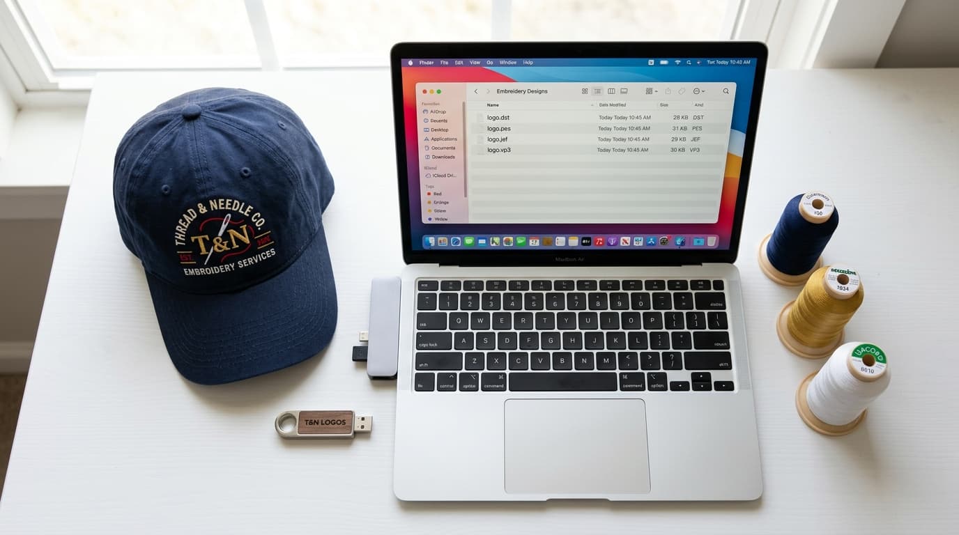
What it looks like: after enlarging a DST or PES file by 150 percent, the fills have gaps and the satin stitches are so long they snag; after reducing it, the design is stiff and the small details merge. Stitch files store finished needle positions, so scaling stretches or compresses the stitches without recalculating density. Anything beyond about 10 percent needs re-digitizing from the working file.
10. Never Test-Sewing the File
What it looks like: everything above, discovered on your production run. A software preview cannot show pull, puckering or thread behaviour. Every file should be sewn on the real fabric type before delivery, and the settings adjusted based on what the thread actually does. If a digitizer cannot send you a photo of the sew-out, assume the file has not been tested.
Quick Diagnosis Table
- Puckering around the design: density too high, underlay too heavy, or insufficient backing.
- Gaps and fabric showing: density too low, no pull compensation, or wrong underlay.
- Thread breaks: density too high, satin too wide, or sharp corners with stacked stitches.
- Unreadable text: text under 5 mm, or thin font with satin under 1 mm.
- Outlines misaligned: bad sequencing, outlines sewn before fills, or loose hooping.
- Design stiff and heavy: excessive density and underlay, often from auto-digitizing.
Get a File That Runs Clean
If a design is giving you problems, send us the file and a photo of the sew-out through the contact page. We will tell you whether it can be fixed or needs re-digitizing, and quote for either. Every file from our digitizing service is manually digitized, matched to your fabric, and test-sewn before delivery, with free revisions if anything needs adjusting on your machine.
Related service
Embroidery Digitizing Services